Data
The current age is marked as the “age of data”. Due to technological advancement, datafication is everywhere and the data guys are datafying almost everything whatever we observe, we see, we talk, we photo, we search, visit or share on the web, we facebook, we instagram, we tweet, the location we visit with or without the intention of any scientific investigation. Therefore, almost anything is nothing but data. We are surrounded by and our daily life is heavily influenced by data.
In the last article Let’s meet a statistician, we have seen how data uncovered the reality in British army base hospital in Crimea. Only after exploring the data using simple statistical devices authority identified that 16,000 among 18,000 soldiers died due to causes other than the battle. Florence Nightingale appreciated the value of the data which eventually contributed to the policy changes in British hospital administration. M. C-Rundel and J. Hardin (2021) in their book “Introduction to Modern Statistics,” said,
“Scientists seek to answer questions using rigorous methods and careful observations. These observations – collected from the likes of field notes, surveys, and experiments – form the backbone of a statistical investigation and are called data.”
Some other examples of how data is influencing important decision making and thus contributing to human life and society are presented below.
Google Flu Trend (GFT) & its parable
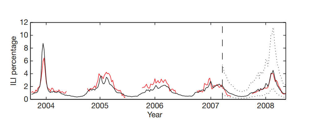
Google receives billions of search query every second. This is a great source of data and by utilising their huge computing power Google processes all the queries continuously. They processed hundreds of billions of individual searches from 5 years of Google web search logs between 2003 and 2008 and built an automated method of discovering influenza-related search queries. The objective was to build a comprehensive model for use in influenza surveillance, with regional and state-level estimates of Influenza-like-illness (ILI) activity in the United States. They have used weekly “ILI-related physician visits” as the outcome variable and weekly count of search queries such as “medicine for cough and fever” as the only explanatory variable to generate the statistical prediction model. Based on the combination of many search queries, they built a model that could accurately estimate the current level of weekly influenza activity in each region of the United States, with a reporting lag of about one day (Ginsberg et al, 2009). Analysing search query data, Google could predict the alarm for a potential pandemic like the CDC does, however Google is even better because they could tell it in near real time. Interestingly, Google does not need to collect swabs for testing; rather, their system is built on “big data”(Kenneth & Mayer-Schönberger, 2013). It is to be noted that the model is useful for areas where a large population uses web searches. GFT is considered an exemplary use of Big Data.

Later in 2013 GFT came to the headlines when Nature reported that Google is predicting more than double the physician visits for ILI than the proportion reported by CDC though GFT built its prediction model to predict CDC reported proportions (Lazer et al, 2014).

Lazer and colleagues identified two issues that may contribute to the GFT’s prediction mistakes: “Big Data Hubris” and “Algorithm Dynamics”. By “Big Data Hubris” they mean making assumptions about big data being a substitute rather than a supplement to the traditional data collection. Whereas by the “Algorithm Dynamics” it is meant there could be errors in measurement, changes in human behaviour, and of course continuous updating Google’s search algorithm. However, Lazer and colleagues suggested that the mistakes were avoidable by ensuring transparency, reproducibility, use of all available data and assessing the algorithm.
John Snow & Broad Street cholera outbreak
The cholera outbreak in Soho, London in August 1954 killed 616 in total within a month which is nothing compared to most recent pandemic, COVID19 though. However, this outbreak has made significant history till date. In the first 3 days 127 people living around Broad Street in Soho died and the death rate continued to grow.

It was predominantly believed at that time that the cholera caused by polluted air “bad air” which is known as “miasma” theory. The district doctor John Snow for the first time claimed that the cholera was caused by contaminated water instead of “bad air” which was contradicting the well believed “miasma” theory. Dr Snow did a very clever thing to prove his belief. He plotted the location of the cholera cases on a map and found that the cases are clustered around the water pump. His discovery influenced public health sanitation policy in the mid-19th century. This is considered one of the earlier uses of location as data in public health problems.
Framingham Heart Study (FHS)
FHS, a phenomenal study that has generated data-based evidence laying the foundation for preventive health care since 1948.

Visit the FHS/research milestones page to get an idea of why the National Institute of Health (NIH) acknowledged FHS as the Crown Jewel of epidemiology. Many of the current health care practises, advice and interventions are due to the FHS findings. Some of the major findings and policy changes due to the evidence generated by FHS are in the table below.
| Year | Findings |
| 1957 | High blood pressure and high cholesterol levels shown to increase likelihood of heart disease. |
| 1960 | Cigarette smoking found to increase the risk of heart disease |
| 1961 | The term “risk factor” introduced |
| 1967 | Physical activity found to reduce the risk of heart disease and obesity to increase the risk of heart disease |
| 1970 | High blood pressure found to increase the risk of stroke |
| 1988 | High levels of HDL cholesterol found to reduce risk of death |
| 1996 | Progression from hypertension to heart failure described |
| 2002 | Obesity is a risk factor for heart failure |
| 2010 | First definitive evidence that occurrence of stroke by age 65 years in a parent increased risk of stroke in offspring by 3-fold |
| 2017 | A game-based intervention that increased social incentives led to increased physical activity among Framingham Heart study participants |
| And many more . . . |
Due to its massive contribution, the NIH said,
“One of the first long-term cohort studies of its kind, the NIH’s Framingham Heart Study is considered the crown jewel of epidemiology. Thanks to Framingham, we now know that most cardiovascular disease is caused by modifiable risk factors like smoking, high blood pressure, obesity, high cholesterol levels, and physical inactivity.”
So, data is everywhere and it heavily influences how we work, live and think. It is therefore critical to know at least a little more about the characteristics of data that we encounter frequently. Understanding data and processing it is an essential skill to equip ourselves with so that we can make our decision right.
Types of data
We can formally define the variable and data as follows:
- Variable: A characteristic that increases or decreases over time or takes different values in different situations.
- Data: Realisation of variable is data.
A simple example of data and variables is in the table below where the attributes of the individual are the variable and the measurement or realisation of those attributes are the data.
| ID | Sex | Smoker? | Obesity (BMI) | Variable |
| 001 | Male | Yes | Obese | |
| 002 | Female | Yes | Normal | |
| 003 | Male | No | Normal | Data |
| 004 | Male | Yes | Overweight | |
| 005 | Female | No | Overweight | |
| 006 | Female | Yes | Obese |
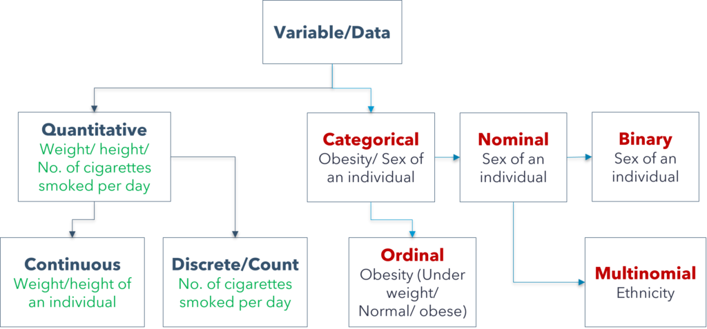
Data can be of many types. The chart below would be helpful to grasp the types of data and their measurement scales.

In short,
- We cannot measure nominal data using numbers rather we differentiate by the name of attributes. If the nominal variable can take only two possible values then it is binary, if it can take more than two values it is multinomial.
- Ordinal data also can not be measured using meaningful numbers, we differentiate them by their name and we can order them from low too high or from worst to best.
- Count/discrete data can be measured by meaningful numbers however they can not take the fraction values. For example, the number of kids in a family which can be 1.5 or 3.2. Always positive.
- Continuous variable can be measured using meaningful numbers with any values, either positive, negative, fractions etc.
In the statistics literature you may see there are four scales: nominal, ordinal, interval and ratio. The analytical techniques depend on the scale of the data. The count and continuous data are either interval or ratio scale data. The data, for example, temperature where zero (0) is not a real zero and the values are with equal interval is the interval scale data. The difference for interval data is meaningful however the ratio is not. For example, 40 degree temperature does not give you a double hot feeling than the 20 degree. On the other hand, for ratio scale data zero (0) is a real zero and you can get a meaningful ratio as well. The analytical techniques for interval and ratio scale are the same most of the time. So, not to worry too much about differentiating between interval and ratio scale. Rather, ask yourself if the data is nominal, ordinal or ratio scale.
Exercise: Complete the table.
| SL | Variable | Type / scale |
| 1 | Length of newborn baby (cm). | |
| 2 | Mother smoking status during pregnancy. (1 = Smoker, 0 = Non-smoker). | |
| 3 | Weight of newborn baby (kg). | |
| 4 | Number of cigarettes smoked per day by mother during her pregnancy. | |
| 5 | Did the baby born with low birth weight (0 = No, 1 = Yes). | |
| 6 | Ethnicity of the mother (British, Asian, African, US, EU). | |
| 7 | Eye colour of the newborn (black/brown/blue). | |
| 8 | Mothers’ educational attainment (primary/secondary/higher). | |
| 9 | Fathers’ highest class of education. | |
| 10 | Birth order of newborn. |
References
- Big Data: A Revolution That Transforms How we Work, Live, and Think.
- Ginsberg, J., Mohebbi, M. H., Patel, R. S., Brammer, L., Smolinski, M. S., & Brilliant, L. (2009). Detecting influenza epidemics using search engine query data. Nature, 457(7232), 1012-1014.
- Lazer, D., Kennedy, R., King, G., & Vespignani, A. (2014). The parable of Google Flu: traps in big data analysis. science, 343(6176), 1203-1205.
- Wikimedia Foundation. (2023, August 19). John Snow. Wikipedia. https://en.wikipedia.org/wiki/John_Snow


Leave A Comment